← back to portfolio
Case Study · 10 / 10
Case Study · Prathmic Education · UX/UI revamp

When a UX revamp doubled the sales-pitch asking price.

A full UX/UI overhaul of Prathmic Education's institute-management SaaS — a complex multi-role platform serving admins, teachers, staff, students, and parents across desktop, tablet, and mobile. The shipped design directly enabled the sales team to double the product's asking price in pitches.

Role
UX / UI · design system lead
Client
Prathmic Education
Product
Institute Management App (EdTech SaaS)
Surfaces
Desktop · Tablet · Mobile
Commercial outcome
2× asking price in sales pitch
Prathmic Institute Management App — desktop + mobile dashboards
§ 01 / Context

Edu-SaaS is commoditised. UX is the last pricing lever.

↳ where a revamp pays for itself

Institute-management software — attendance, gradebooks, fee management, transport, announcements — is a mature category. Every incumbent has the same feature list. The spec sheets are indistinguishable. A school principal evaluating three vendors will find Vendor A, B, and C all claim the same modules.

This matters commercially. When feature parity is the floor, the product that wins the sales pitch is not the one with more features — it's the one whose screens make the buyer feel competent. A dashboard that looks professional, reads at a glance, and handles edge cases gracefully becomes, in the pitch, the visible proof that the vendor is serious. A dashboard that looks dated, reads as cluttered, or hesitates on responsive breakpoints becomes the reason to say "thanks, we'll get back to you."

The UX/UI revamp for Prathmic's institute-management app was commissioned with this commercial reality in view. The brief wasn't add features. It was make the product feel worth twice what we're currently asking for.

You can't out-feature the category. You can out-design it.
§ 02 / The Multi-Role Problem

Five stakeholders. One product.

↳ admin · teacher · staff · student · parent

An institute-management platform is not a single app wearing five hats — it's five apps that share a backend. Each role has a different mental model of what the product is, and designing for any one of them at the expense of the others is how enterprise software becomes a joke.

  • Runs the institute. Needs bird's-eye view: attendance rates, fee collection, enrollment pipeline, staff utilisation, budget vs actuals. Lives on desktop. Reading dense tables is the job. Information density is a feature, not a bug.
  • Runs a classroom. Needs today's roster, today's schedule, quick gradebook entry, announcements to post. Toggles between desktop (planning) and mobile (in-class). Speed matters; three-tap journeys are the ceiling.
  • Runs operations. Transport logs, inventory intake, accounting entries, admissions desk intake. Narrow workflows, repeated many times a day. Needs the opposite of dashboard fireworks — just fast, specific forms that don't get in the way.
  • Uses it as daily utility. Timetable, homework, announcements, grades. Expects the ergonomics of a consumer app, not an enterprise dashboard. Mobile-first by default.
  • Wants reassurance, not complexity. Child's attendance, fees due, announcements, upcoming events. The least time spent per session of any role. Every screen has to answer "is my kid okay?" in under three seconds.

The principle that governed the revamp: show each role only what matters to that role, in the grammar that role reads fastest. Admin screens lean into density and data-tables; student and parent screens lean into cards, icons, and generous whitespace. Teacher screens navigate between both worlds, carefully.

This also maps onto Stephen Few's dashboard design principles — every dashboard serves a specific audience, at a specific cadence, answering a specific question. Trying to serve all audiences on one screen is the single most common dashboard failure mode; the remedy is role-scoped views, not more widgets.

§ 03 / Workflow

Sketch first. Figma second.

↳ low-fi before mid-fi before pixel
From UX to UI — hand sketches exploring composition, structure, functionality

Enterprise dashboards are the category where starting in Figma bites back hardest. The tool is so capable that a designer can produce a plausible-looking screen before they've answered whether the underlying information hierarchy is right. The result is polish applied to the wrong composition — a familiar failure mode in SaaS UX.

The workflow that made this project scale was deliberately inverted. Every new screen started on ruled notebook paper: boxes, arrows, lists of questions the screen had to answer, candidate layouts. No type specimens, no colour, no grid. Just composition, structure, functionality, and information relevance — and whether what gets displayed actually answers what that role came to the screen for.

The sketches weren't artefacts for anyone else. They were a forcing function for the designer — a way to cut through "this looks nice in Figma" to "this answers the question in the least number of eye movements." Only once the sketch resolved did the mid-fi and high-fi work in Figma begin.

§ 04 / Design System

Not a style guide — a component library.

↳ the real deliverable
Design system — Figma component library, responsive variants, properties

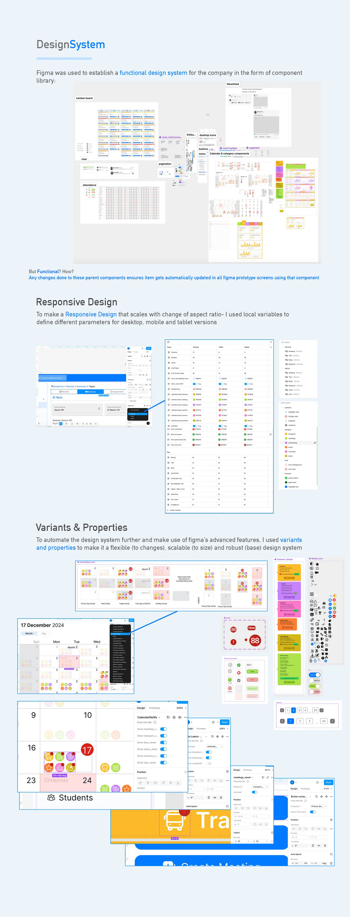
The design system was the project's highest-leverage artefact. With ten modules (dashboard, reports, academics, users, announcements, transport, inventory, accounting, admissions, settings) × five roles × three form factors, the number of unique screen states the product could present ran into the hundreds. Designing each individually was not an option.

The system was built as a functional component library in Figma — components with variants and properties, not decorative pattern illustrations. A "table" component carried variants for compact / comfortable density, sortable / non-sortable columns, empty / populated states, loading / error / success states. A "card" component carried variants for admin-density / student-friendly / parent-light layouts. A "chart" component carried Stephen-Few-compliant defaults: no 3D, no pie charts for more than two categories, small-multiples instead of stacked bars where possible.

The system also carried responsive design as a first-class concern — variants at desktop / tablet / mobile breakpoints, so every screen's responsive behaviour was designed, not discovered at hand-off. For a product that would live on a school admin's laptop, a teacher's tablet, and a parent's phone, this couldn't be an afterthought.

The outcome: new screens took an afternoon, not a week. Consistency across modules was structural, not cosmetic. When the sales team asked for a pitch-ready mockup of a feature that didn't exist yet, the system could produce it credibly in a day. That speed compounded — and is a non-trivial part of how "doubled asking price" became possible.

§ 05 / Ten Modules

The full surface area of running an institute.

↳ everything a school does, operationalised

The product covered the full operational footprint of a K-12 institution. Each module was its own sub-product with its own users, its own flows, its own data model — all tied to the same design system:

§ 06 / Screens

Across three surfaces.

↳ desktop · tablet · mobile
Institute Management App — full product composite
§ 07 / The Sales Pitch as UX Test

The pricing room is a usability lab in disguise.

↳ where B2B UX actually gets graded

Most UX work in B2B SaaS is tested against task-completion metrics, error rates, time-on-task. These are fine metrics. They are not the metrics that determine whether a product wins a buyer.

The real usability test in B2B is the sales pitch itself. A school principal, in the room, with the sales engineer clicking through the product — their body language, their questions, their half-spoken concerns are the most concentrated qualitative usability signal the product will ever get. When the principal leans forward at the dashboard; when they start narrating what they think they're seeing; when they ask about a feature that isn't on the spec sheet but is visible on the screen — the UX is working. When they say "and how do I find [X]?" and the answer takes more than ten seconds to demonstrate — the UX is not.

The revamp was tuned against this specific signal. Every design iteration was reviewed with the question how will this screen behave in a pitch? — not just how does this screen behave in use? The two questions overlap but are not identical. Pitch-optimised screens lead with the buyer's mental model, surface the most impressive data front-and-centre, and hide complexity behind progressive disclosure. Use-optimised screens trade drama for efficiency.

A product built to win the pitch, that also works under daily use, is a product that earns premium pricing. The 2× outcome wasn't magic — it was the predictable effect of designing for both sides of the buyer's attention simultaneously.

§ 08 / Outcome

Design that showed up on the invoice.

↳ commercial effect of a UX revamp
Asking price lift
10
Modules designed
5
Stakeholder roles
3
Form factors

The UX/UI revamp enabled Prathmic Education to credibly double the asking price in sales pitches — a direct, measurable, revenue-shaped outcome that most UX projects never get to claim. The design did what the feature list alone could not: made a saturated-category SaaS feel like a premium product.

The durable residue of the project, though, sits in two places. First, the design system — Figma component library with variants and responsive breakpoints — continued to produce new screens long after the initial revamp, because the system had been built to carry the product forward, not to decorate it for one pitch cycle. Second, the pricing-as-UX-signal framing — that enterprise design is ultimately evaluated in the sales room, and designing with that room in view produces different screens than designing against task-completion metrics alone.

Of all the projects in this portfolio, this one sits furthest from games. And yet the underlying move is the same one that runs through the match-3 work, the Collection System case, the Research Strategies toolkit: be specific about who the user is, what they came for, and what the surface has to do for them — and design the rest as infrastructure, not decoration.

↑ design showed up on the invoice.